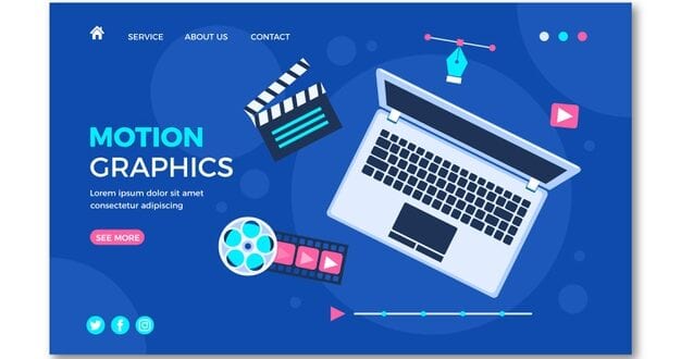
Motion design is a design direction that is a combination of graphics and animation. Dynamic graphics always grab the attention of users, which is why animated videos are often used in advertising, film, television, and so on. The most striking example of motion design titles for films and TV series, where, in addition to videos, animated pictures, special effects are used, typography, and other images are inserted in an animated explainer video.
Motion design is a relatively new direction in design. A motion design product is a whole story in which motion graphics are given special meaning. These are not just special effects that are used by developers for “decoration”. Motion design means creating videos in which each dynamic effect carries a specific meaning and is added to draw attention to a specific element, present the benefits of a product, and so on. That is why motion design is often used in professional explainer videos by Explain.ninja.
Examples of using animation explainer video in web design
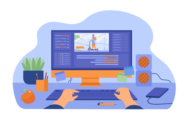
Let’s take a look at the basic techniques that web designers use when applying motion design to pages. These tips & tricks can be helpful for newbies, as well as well-skilled and trained editors, graphic designers, as well as web designers. Just know that these will make a difference when it comes to your editing skills, especially if you are doing some projects on your own.
Top 10 examples of using animation explainer video in web design
1. Animated logos
An interesting technique used by designers is logo animation. You can have a personalized & unique logo that has your preferred animation that suits your brand or your personality.
2. Background
To make the site different from other companies with similar topics, interest the user and successfully sell the product, designers use various techniques. One of them is the use of motion design rollers as a background. The background is key & crucial since no one wants to look at plain & white or monochrome options.
3. Motion design video background
Here the video is intertwined with the drawn graphics. Designers show how watches are constructed – a product that is described on the resource. Such a background interests the user, it looks impressive and is remembered. Motion design video background features are becoming more popular as the industry changes & grows in time.
4. Navigation elements
Animated graphics in best explainer videos involve the use of animation on sites as a separate element of the layout. In this way, designers create components that can no longer be attributed to the traditional details of the site. Elements that can use motion design include navigation elements.
5. Calls to action
While motion design in navigation in 3d animation explainer video is used primarily as an add-on, animated CTAs serve a different purpose.
Since one of the goals of a website is to sell a product or service, calls to action play a special role. Buttons, forms, contact blocks, banners with fields – all these are tools to increase conversion. With the help of motion design, you can attract the user’s attention, interest him and induce him to take the target action – subscribe to a newsletter, place an order, leave contact information, buy a product, etc.
6. Advertising banners
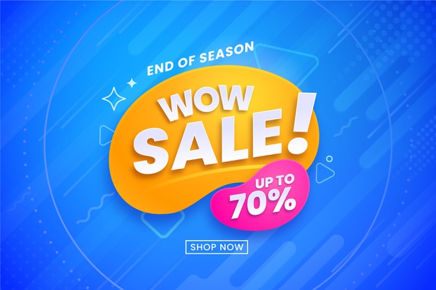
With the help of motion design and animated videos, you can attract the attention of users to promotions and advertising offers. Traffic always attracts the interest of site visitors, you unconsciously pay attention to dynamics. This is why motion design is so popular among marketers. Advertising banners will always seem to exist since they are a popular marketing trick that works.
7. History site
Sometimes designers strive to create a completely unique and non-standard resource. In this case, motion design is applied as a whole concept of website design. The design of the resource is completely based on motion design and tells the user a whole story about the product, company, and so on. This technique is also called storytelling. It helps with more complex projects & makes them appealing, as well as simpler to understand.
8. Product presentation
Promo sites are resources that are intended for the presentation of a particular product or service (we wrote more about promo sites here). Often, motion design is used on promotional sites, as it is one of the most effective ways to increase brand awareness and attract the attention of the client, to interest him with interesting techniques, or without overdoing it.
9. Video content
How well aware are you when it comes to the production & making of video content? Designers use motion design to complement the text and graphic content. For example, they insert videos on the page that tells about the product. Video content is a popular way to grasp someone’s attention. It is also easy to understand and will suit beginners who are getting started with motion design.
10. 3D effects
3D graphics are also a relatively recent trend, actively used in motion design and design in general (we have already talked about 3D typography in web design). The 3D effect is a great way to show a product from all sides, to create a sense of volume. If the project is complex & has layers to it (literally) you can easily showcase it with the 3D approach.
So, how do you become a motion graphics designer?
There is no single path into this career, which is great news! You can take loads of different routes and still end up working in this field. Some can do a course and others can have their bachelor’s degree and a strong portfolio of work. Nowadays there are loads of different & helpful tutorials online and on YouTube that can help you get the needed knowledge & level of expertise. In the end, how do you feel about motion graphics in general, and do you want to work in this field?
Hopefully, these 10 tips were helpful, let us know where you stand at the moment!
 Imagup General Magazine 2024
