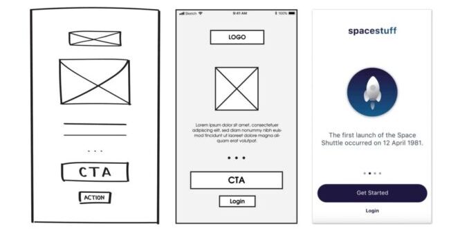
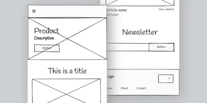
Low fidelity wireframes are the unsung heroes of the design world. They are the skeletal, basic visual representation of a design’s layout and functionality. Often devoid of color, detailed content, and high-resolution images, these wireframes serve as the foundation upon which intricate designs are built.
Their simplicity is their strength, allowing artists to focus on the core structure without getting bogged down by intricate details. In the realm of design, where the allure of aesthetics can sometimes overshadow functionality, the concept of simplicity becomes paramount. It ensures that it remains user-centric, intuitive, and accessible.
Understanding the Basics of Wireframes
At its core, a wireframe is a blueprint. It’s a visual guide that represents the skeletal framework of a website or app. Think of it as the architectural plan of a building, outlining where each element will go. While wireframes can vary in detail and complexity, they generally fall into two categories: low fidelity and high fidelity.
Low fidelity wireframes are rough, basic, and often hand-drawn. They focus on functionality, layout, and the user journey. High fidelity wireframes, on the other hand, are more detailed, often including color, typography, and even interactivity.
The Power of Simplicity in Design

Simplicity is not about lack; it’s about clarity. In design, simplicity ensures that the user’s experience is straightforward and intuitive. A cluttered type can confuse users, leading to a higher bounce rate and lower user satisfaction.
Apple’s clean and minimalistic design approach or Google’s uncluttered homepage are prime examples of simplicity driving success. These designs, while appearing simple, are backed by complex thought processes and a keen understanding of user behavior.
Defining Low Fidelity Wireframes
Low fidelity wireframes are the initial sketches in the design process. They’re often devoid of intricate details, colors, or high-resolution images. Instead, they focus on structure, layout, and user flow. These wireframes are not about how the product looks, but how it works. They prioritize the core functionality over aesthetics, making them invaluable during the early stages of design, where rapid ideation and iteration are crucial.
Creating a Minimalistic Blueprint

The beauty of low fidelity wireframes lies in their minimalism. They use basic shapes, lines, and placeholders to represent elements. A rectangle might represent an image, while a line could indicate text. This abstraction allows designers to focus on the bigger picture without getting sidetracked by details. It’s about capturing the essence of the project, ensuring that the core elements are in place before diving into the intricacies.
Benefits of Starting with Low Fidelity
Starting with low fidelity wireframes offers numerous advantages. They’re quick to create, allowing for rapid ideation and immediate feedback. This speed is invaluable in the early stages of a project when ideas are still fluid.
They foster collaboration, serving as a visual tool that designers, stakeholders, and developers can rally around, bridging the gap between technical and creative teams. Moreover, their simplicity makes it easier to spot potential flaws in production. This clarity ensures that issues are addressed early in the process, reducing the risk of costly changes later on.
Streamlining the Design Workflow

Incorporating low fidelity wireframes can significantly streamline the design workflow, making the process more efficient and focused. They serve as a reference point, guiding designers as they refine concepts and make informed decisions.
This guidance is crucial in ensuring that the direction aligns with the project’s goals. By focusing on the core structure first, designers can ensure that the foundation is solid before adding layers of detail. This approach not only saves time but also ensures that it remains cohesive and user-centric, prioritizing the user experience from the outset.
Iterating for Improved Design
Design is an iterative process, and flexibility is key to achieving the best results. Low fidelity wireframes, with their basic structure, encourage frequent iterations, allowing designers to test and retest concepts.
As feedback is gathered, these wireframes can be easily tweaked and refined, ensuring that the design evolves in the right direction. This iterative approach, driven by feedback, ensures that the final product is both functional and user-friendly. It also reduces the likelihood of major overhauls later in the design process, which can be time-consuming and expensive.
Collaborative Design Thinking

Low fidelity wireframes are collaborative tools, acting as a universal language in the design world. They’re often used in workshops, brainstorming sessions, and client discussions, providing a visual representation of ideas.
Their simplicity ensures that everyone, regardless of their expertise, can understand and contribute to the discussion. This inclusivity fosters a more holistic design approach. They align stakeholders’ expectations, ensuring that everyone is on the same page, reducing misunderstandings and ensuring a smoother process overall.
Maintaining User-Centric Focus

At their core, low fidelity wireframes are user-centric, designed with the end-user in mind. They prioritize user needs, behaviors, goals, and journeys, ensuring that the design caters to the target audience effectively. By mapping out the user flow and interactions, they ensure that the design remains intuitive, providing a seamless experience.
Their simplicity prevents overdesigning, ensuring that the design remains accessible and user-friendly. This focus on the user ensures that the final design is not only aesthetically pleasing but also functional and efficient.
Transitioning to High Fidelity
While low fidelity wireframes serve as the foundation, the design process eventually transitions to high fidelity one. These detailed designs build upon the initial wireframes, adding layers of detail, color, and interactivity, bringing it to life.
The low fidelity wireframes serve as a guide, ensuring that the design remains true to its core objectives while adding depth and detail. This transition is seamless, with the initial wireframes acting as a roadmap, guiding designers as they flesh out the plan, ensuring consistency and coherence throughout.
Conclusion: Embracing the Simplicity in Design
In the ever-evolving world of design, simplicity remains a timeless principle. Low fidelity wireframes, with their focus on structure and functionality, embody this principle. They remind designers of the importance of a strong foundation, ensuring that plans are not only aesthetically pleasing but also functional and user-centric.
As designers, embracing the simplicity that low fidelity wireframes offer can lead to more effective, impactful, and user-friendly designs.
If you are working on a new website, you may want to check our article about how to keep your UX design inspired and gain new ideas that you can implement along the way.
 Imagup General Magazine 2024


