Every e-commerce entrepreneur agrees that an appealing landing page is essential to making conversions. First impressions are everything: they’re the difference between a visitor and a sale.
Put simply, and a landing page is a standalone web page with a CTA. Getting to the front page of Google costs money, and your landing page plays a huge role in determining how cost-effective your ad campaign is. There’s a lot more to landing pages than making them visually appealing and providing a CTA, and this is exactly what this article aims to cover!
We’re going to identify the essentials of a solid landing page, from the perspective of both design and content, in a way that helps you customize your pages to your business, audience and personal tastes. Let’s begin.
1. Goal-Oriented
Before you start creating your landing page, the first thing you need to decide on is what your end goal of this landing page is, what should it do? Not only does this influence what you will include in your landing page, but it also indicates how you will measure its success and decide upon necessary changes to lead your customers towards a certain outcome.
It’s important to remember that your landing page should only ever aim to achieve a single conversion objective. Clarity of goals is absolutely crucial: a muddled landing page that doesn’t know what it wants isn’t going to get what you want. Similarly, a landing page that asks for users to fill out a five-page family history is never going to get any clickthroughs.
A good goal gets a single critical piece of data from a customer and achieves it by a small free offer of goods or services. If you’re a sucker for online clothes shopping, you probably will immediately think of the “get 10% off your first order” in exchange for your email address.
Some concrete conversion goals are:
– Receive an email address
– Complete a survey
– Download a coupon
– Download a free relevant product, e.g., ebook
– Enter a free trial
2. Meaningful Content

Writing effective ad copy is another challenge on its own. It needs to be snappy, persuasive, efficient, and informative. Depending on the conversion goal you’ve chosen, you need to clearly explain your proposal and what the customer needs to do to receive it.
If any of the content you’ve included is time-sensitive, you need to make sure it’s up to date. Many companies will forget to update landing pages that do not concern their main products or services. It’s important all possible landing pages have been optimized—each click is an opportunity!
3. Aesthetic Design

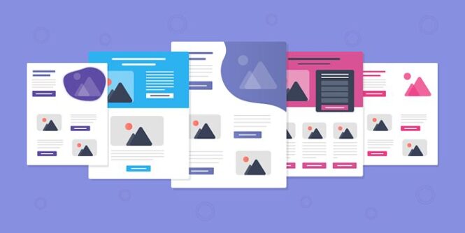
Design is a huge influence on landing page credibility. If it looks terrible, your users won’t trust you are going to bounce almost immediately. Landing page design shouldn’t distract your customers if they want to take the time to appreciate it, that’s on them! Good landing page design doesn’t distract the user: ideally, you want them not even to notice how beautiful your design is and already be reading about the value you can provide them.
Here are some landing page design aspects to remember:
Images: any images you implement should be high quality and optimized to promote fast loading speed. It goes without saying that they should be attractive and on-brand. Generally, you want as few images as possible on a landing one: one key image usually does the trick.
White space: white space is a good thing! Keeping things simple stops you from making your landing page more complex than it needs to be. That doesn’t mean the perfect landing page is a single form field in the middle of a white void, merely that less is more, and good deployment of white space is extremely visually appealing.
Font: any typeface you use should be easy to read. Consider the color of the font in regards to the background or nearby visual elements. They shouldn’t clash or affect each other negatively in any way.
Device Compliant: your landing page should adapt to all mobile operating systems, or at least those that make up the majority of your customer database. By 2024 mobile e-commerce is expected to dominate online sales, is responsible for 54% of total sales.
4. A Unique Selling Proposition (USP)
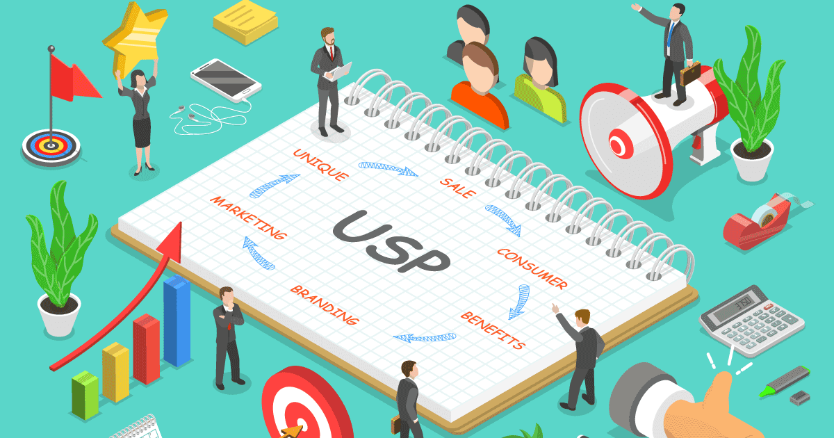
This is what differentiates your business from all of your competitors. What makes your offer the best? Your USP should emphasize the most beneficial part of your offer for your customers and therefore will maximize the chances of turning them into a lead.
5. Call-to-action (CTA)
A CTA is ideally very short but is arguably the most important single feature of your entire site. This sometimes sits apart from the rest of the copy and is emphasized by design features. If you’d like to gain an email address, the CTA may be included just above or below a lead capture form.
6. Including Social Proof
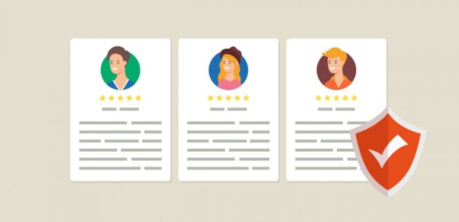
It’s all well and good to claim your product or service is better than your competitors, but that’s exactly what all you’re competitors are saying! This is where social proof can provide that extra positive and comforting influence to generate more leads. Social proof is the reason we prefer to enter restaurants that already seem busy and is a tactic that can make your landing page a success.
There are a few different ways of providing social proof, some that will take up more space on your landing page but can be persuasive. Let’s go through them:
Customer Testimonials: Nice and easy! Taking positive testimonials from previous clients and pasting them onto the page. The amount of space they take up is dependant on how many you’d like to include, though, for the sake of simplicity, less is more.
Case Studies: These take up more space as they usually require more content compared to a testimonial. They also are more likely to include an image and a link to a fuller version of the case study.
Social Sharing Bar: You’ve probably noticed this on blogs. A small bar at the end of blogging sites containing popular social media site logos (Facebook, Twitter, and Google+), displaying the number of shares or likes that your landing page has received. This will only provide social proof if you have a persuasive amount of likes and shares.
The number of registrations/users/downloads: This involves including a certain number or live ticker that displays the popularity of your product or service. You should only display this once you’re at a number that reinforces credibility. For a design company, this may be 1000+ clients served, whilst for an app developer, this may be 100,000+ downloads.
7. Lead-Capture Form

Without a lead form, it’s impossible to achieve your goal. There are many aspects of your lead capture form that should be considered—after all, you don’t want site visitors to leave at the last hurdle.
Usually, it’s better to put the form above the fold, but many still include it at the bottom of your screen to keep more focus on the content. Another aspect is the length of the form itself and the amount of data you’d like to gain. The longer the form, the more potential data gain you have, but the fewer people will bounce. When it comes to filling out forms, remember this is your landing page, not a doctor’s appointment!
It’s recommended that you only ask for the information you need, and that is appropriate. Asking for a phone/mobile number when your offer is an email newsletter doesn’t make sense. Furthermore, it’s not GDPR compliant, and that’s going to cause you a serious headache. You should also provide a link to your privacy policy to comfort those customers who feel uneasy providing any sensitive information.
Getting Things Right
Landing pages are rather simple, but achieving simplicity isn’t necessarily easy. Your business needs the best developers, designers, and digital marketers who are up-to-date with optimal e-commerce practice. Understandably, if you’re a startup or even a larger business, having all these roles with the necessary expertise isn’t financially viable, right? This is only true if you’re only considering hiring in-house! You have other external hiring options, such as freelancers or development companies. Both of these options save you the unnecessary cost of contracting locally and the accompanying sometimes lengthy hiring process. By looking for external hiring options, you can ensure high quality, cost-effective landing pages that can begin development immediately.
Landing Page Specialists: Freelancers
For the best landing page freelancers, we would recommend Upwork. Where you can find experienced freelancers for a short-term landing page work! Before hiring, keep in mind that it’s crucial to check previous case studies of the freelancer and thoroughly read previous reviews about his/her work. Finally, you should interview (phone or video call) the person that you want to hire, to gauge his/her expertise. Check this blog if you want to learn more about Freelance Software Developers.
Landing Page Specialists: Development Companies

Larger development companies will specialize in a wider array of sales platforms and will usually have cost-effective hiring packages. This allows you to extend your hiring plan beyond a single landing page specialist if you need to and saves you the hassle of looking to go hiring again.
Here are two outstanding options for a landing page design that generates leads, not clicks. Take a look at their work portfolios for yourself!
CodeClouds: this development team specializes in multiple e-commerce platforms, including Shopify and Magento. They have completed 1800+ e-commerce tasks and have almost a decade’s worth of success that has enabled them to expand globally (The USA, India, Australia, and New Zealand). If you are looking for a Shopify or Magento development company with optimized landing page creation, CodeClouds are a great choice.
iKnowledge Factory (IKF): IKR is more design-centric but can provide design and content for your landing page if desired. Although this needs to be made clear during consulting, communication is everything when hiring externally. They have designed hundreds of landing pages for previous clients and take about 2-3 days to create one.
 Imagup General Magazine 2024
