A blank wall can make the entire room feel boring. However, blank walls are the perfect opportunity to give a room a splash of color through various interior decorations. One of the trends in interior design is posters and prints. These decorations are popular due to the variety of designs available, ensuring there’s a design that’s suited for every homeowner’s taste and preference, as well as giving the room pops of color––whether you’re going for cool or warm colors, there’s always a poster available.
Moreover, as posters are becoming popular, there are now plenty of designs and suppliers to choose from, giving you plenty of options. Just make sure to source your posters from a reliable manufacturer, such as FineArtAmerica. By doing so, you’re getting high-quality posters and an assurance that the posters will serve as a wonderful aid in your overall interior aesthetic.
Once you’ve chosen some posters, make sure to consider these tips when displaying them, enabling your room to harness the benefits that posters and prints bring:
1. Choose the right place
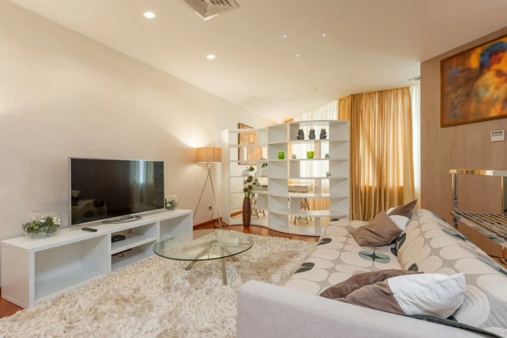
The first thing you should consider when decorating your walls with posters is to look for the right place to show them off. Generally, homeowners often hang poster prints above their sofa, fireplace, or credenzas. But you’re always free to hang them anywhere you want, as long as the poster will complement the theme of the room or condo.
For instance, depending on your poster’s size, you can decorate your windows or put them on your shelves using these beautiful interior decorations. Just make sure that you consider the poster’s height to avoid hanging them too low or high. In fact, a major principle in interior design states that the poster should be in your eye line so it’ll create a long-lasting impression on viewers. Lastly, if you have the budget, you can add LED lighting to highlight your posters. This way, your posters will certainly grab any viewer’s attention.
2. Mutual harmony
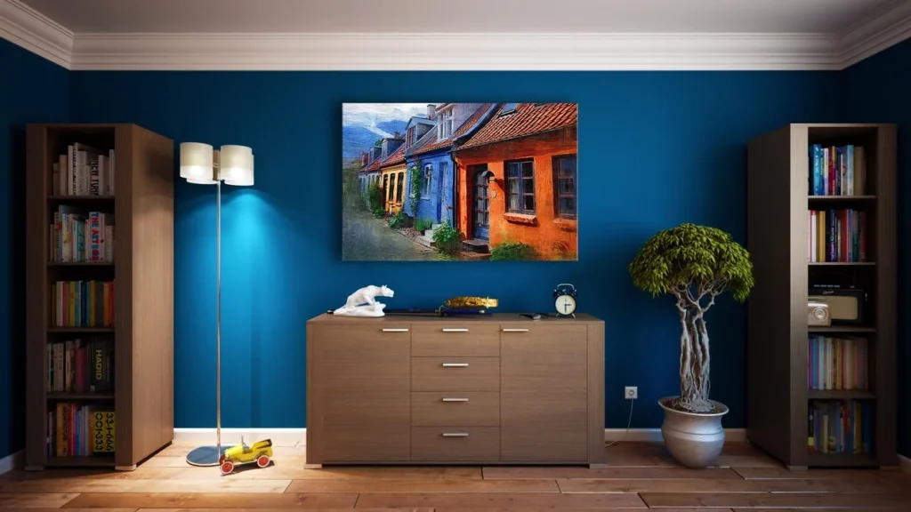
To create mutual harmony, group different posters together so you can make a gallery wall. For instance, if you have similar posters in terms of height and their frames, group them to generate a feeling of flow and continuity. Additionally, if you have posters that have the same theme and size, hang them above the dining table or sofa to create a feeling of harmony.
Another tip: if you have a low ceiling, group posters in three and hang them in a row. On the other hand, if you have a high ceiling, group your posters evenly (in four or six) and then hang them in two rows.
3. Choose the right style of frame
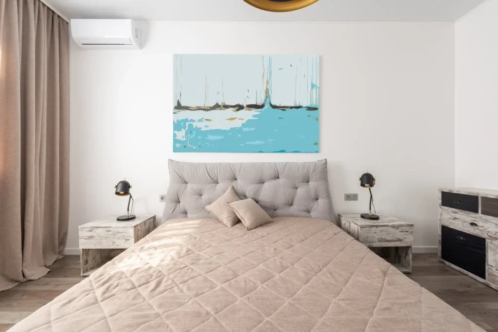
The frame is an essential element in design that the wrong one can negatively affect any interior decorations you have, including posters. This is because the frame provides any artwork with both depth and balance, elevating the artwork’s overall design.
Furthermore, consider the theme of the artwork when choosing the right frame. For instance, if you have a vintage-looking poster, you can either opt for distressed metal or museum glass frames.
Remember, both of these frames are heavy, so practice caution when adding these above your floorboards. For modern-styled posters, it’s best to resort to newer brackets, such as plastic and wire mesh.
4. Use posters to determine the room’s color palette
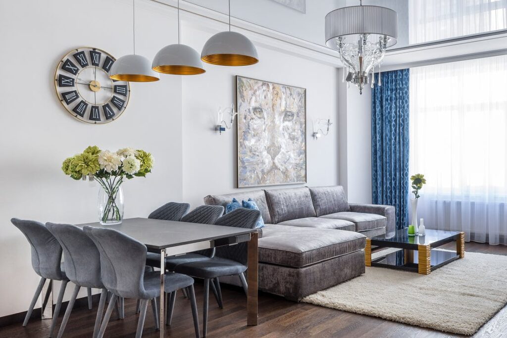
One of the ways for you to tie up the entire room together is to have a color palette. Most homeowners often use their favorite colors when choosing a palette. However, there are times when people can’t decide what color they want to use as the color palette of the room––perhaps their favorite color won’t go well with the room’s theme. In this case, you can use your available posters as a basis.
Select two to three colors from your posters that you want to feature and highlight the space. Once you’ve determined the colors, you can then use them as a point of reference when buying other home accessories or furniture. By doing so, not only will the room exude the same theme, but your posters will also be emphasized.
5. Distribute the posters’ colors
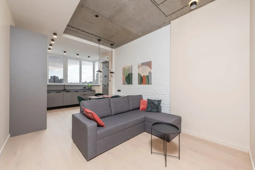
Colors can be quite tricky to work with. However, one thing you can do is to avoid using a particular color in one part of the room. This mistake will create an imbalance in your home’s overall aesthetic. Hence, make sure to spread other colors over other areas of the walls, too. As a tip, don’t be afraid to unleash your creativity. You can always mix and match different colors as long as they complement each other. Additionally, concerning the tip above, the colors of your accessories and furniture should complement not just each other, but other interior wall decorations as well.
6. Correct the room’s flaws
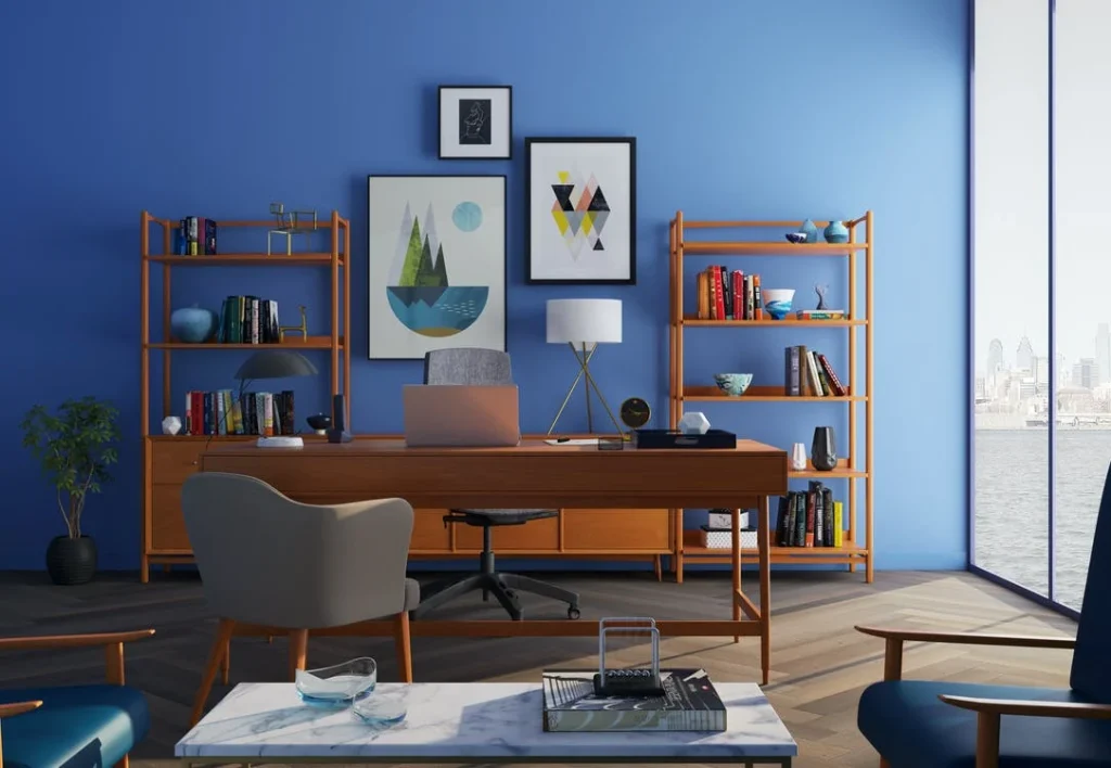
Depending on the room, you can actually use posters to correct any of its flaws. For instance, if placed in the right spot, posters can compartmentalize various zones in a room. Also, if you want to create the illusion of height on your ceiling, hang the posters vertically. The poster’s horizontal position will visually lengthen the wall. If you have large furniture, make sure to use large posters as small ones may be inappropriate and won’t attract the viewer’s attention.
Moreover, if you have black and white posters, arrange them asymmetrically, especially if you’re planning to face these decorations in your home office. Black and white posters that are arranged in an asymmetric order won’t distract your productivity. Instead, they’ll create an avenue for you to rest your eyes, which is helpful if you have a long working day.
Takeaway
As you can see, there are plenty of ways posters can elevate your overall interior design. Just remember to refrain from placing them without considering some interior design principles. Also, make sure to source your posters from a reliable supplier. This way, you’ll have posters that aren’t only of high quality, but you’ll have plenty of selections to choose from, ensuring you’ll find one that suits your taste and preference.
 Imagup General Magazine 2024


